a case study from
*Exposing the Magic of Design: A Practitioner’s Guide to the Methods and Theory of Synthesis*
edited by Jon Kolko
Oxford University Press
Dubberly Design Office consults on development of software and services. We follow a user-centered process that often involves mapping. We use concept maps to represent factors that influence the product development process. We regularly map user goal structures and user interactions; business models and resource flows; and hardware and software infrastructure and information flows. Increasingly, we are called on to map data models and content domains.
Many of today’s new software applications and online services integrate content more deeply than earlier desktop productivity applications. As Nicholas Negroponte predicted, content, computing, and communications have converged.
A concept map is a collection of terms related to
a main idea. Links between terms form a structure—something like an outline, but with some branches connected. Labeling a link with a verb creates a
noun-verb-noun chain that can be read as a sentence.
Thus, concept maps present a series of propositions related to each other and a main idea. Mapping a content domain—creating a concept map—is an effective way to understand a domain.
Sharing a concept map with project stakeholders is an effective way to identify errors in understanding and reach consensus on content definition, structure, and boundaries. Mapping a content domain is
a good way to prepare for designing or redesigning a content rich web site, application, or service.
The Benefits of Concept Mapping
—
**Deepening Understanding**
We developed a concept map of Java as a way
to understand Java. The map helped us prepare to redesign and re-launch Sun’s main web site for Java developers, java.sun.com. Concept mapping was one of many tools that we used in the design process, including auditing the existing site, reviewing site traffic logs, and interviewing Java developers. This case study focuses on the Java concept map and does not describe the other tools or the larger site redesign effort.
The main question that we faced was this:
How should we organize java.sun.com? What should the information architecture be? Answering these questions was not trivial, since the site contained more than 110,000 pages. It couldn’t be reorganized by simply reading a few pages and moving them around. What we needed was a deep understanding of Java—what it is, how it’s used, how it changes, and why it matters.
The trouble was: We knew little about Java except that it was a programming language that runs in many environments. We developed the Java concept map so that we could learn what we needed to know. The knowledge we gained making the map enabled us to propose revisions to the site’s infor-mation architecture with confidence—and helped us backup our proposal with reasoning built on a firm foundation—reasoning built on a definition of the content domain (i.e., the Java concept map) already accepted by the client and his many internal constituents.
**Building Trust**
Like any large corporate project, the redesign of java.sun.com encountered political issues. First, it was a visible project in a decentralized company. That meant the project had a lot of vocal stakeholders. In addition, java.sun.com was managed by Sun’s Developer Relations Group, which had recently been formed by consolidating several previously separate departments. Not everyone was happy about the new organization.
As we began to meet internal stakeholders, we encountered considerable skepticism about the site redesign project and our ability to execute it.
Developing the concept map became a way to engage known stakeholders, discover new ones, and build trust.
We interviewed a series of Sun employees involved with both Java and java.sun.com. We began with a small group, who in turn suggested others. Eventually the number of employee interviews exceeded 50. We also asked the stakeholders to review the concept map as we developed it.
At a project meeting a few weeks into the process, one of the key stakeholders reviewed the map and said, “Not bad. It looks like you’re ready to meet the Java Distinguished Engineers.” Before that, no one had mentioned these high priests of Java; they turned out to be a powerful constituency. The map helped us find them and gave us entree—both permission to meet and something to discuss. Those meetings went well; the Distinguished Engineers were intrigued by the map. (It’s not often someone turns up with a map of your baby.) We also entered the discussions with more credibility than we had at the start of the project, since we had clearly done a lot of homework to get the map to where it was. The organization did us a favor by revealing the Distinguished Engineers only when we were prepared to meet them.
The most important benefit of the map, though, was that we were able to discuss the structure of Java with the Distinguished Engineers (and other stakeholders) on its own terms, apart from its instantiation in the web site. In other words, we were able to discuss the structure of Java and ensure that we understood it, rather than discuss a menu system or page layout, which might have conflated issues—the structure of Java, the site information architecture, and the appearance of the navigation interface.
By separating content from expression—by mapping—we were able to establish relationships and build credibility and trust, before proposing changes to the client’s baby, the Java web site.
**Other Uses**
While the main goal of the concept map was to help the design team understand Java so that we could reorganize java.sun.com, it soon became clear that the map might have wider uses. Our working version of the map looked like a sketch, which reflected the constant changes we were making. (It was messy.) The sketch form invites comments—where a more polished form may inhibit comments.
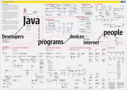
When we reached consensus on the content, we formalized the map’s appearance. Eventually, the map went through two printings and was distributed to more than 25,000 Java developers. We also created an interactive in [Flash version][1] of the map.
The Process of Concept Mapping
—
At the beginning of the java.sun.com redesign project, we asked to see Sun’s models of Java. We were unable to locate detailed models, but we did find slides from marketing presentations—”marketectures”, versions of technical architectures simplified by marketing people. One of these marketectures depicted Java as the Parthenon; three steps supported a few columns capped by an architrave and a pediment. This model included less than a dozen elements. It became our starting point.
**Set Goals**
Setting goals is the key to managing. Rick Robinson points out that all research should begin with a clear goal, what he calls a “hunt statement”. Likewise, mapping should begin with a clear goal. A simple way to clarify a map’s goal is to write a “working title.”
We set six goals for the Java concept map:
1. Develop an understanding of Java shared among the java.sun.com redesign project’s stakeholders.
2. Inform both the logical organization of java.sun.com and its integration with other sites.
3. Develop a framework by which changes to Java can be understood.
4. Open a dialog with senior Java stakeholders.
5. Provide an overview of Java to people familiar with computing but unfamiliar with Java.
6. Develop a map that an average Java programmer would consider accurate.
**Identify Terms**
The first step in developing a concept map is to identify terms that could be included. In this phase, the goal is to quickly explore the domain. Write down whatever you find or think of. Editing comes later.
Our first list of terms came from the team’s own experience, from glossaries of Java terms, and from the indices of books on Java.
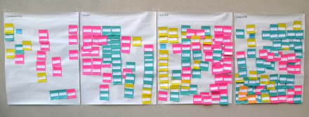
We kept our list of terms in a spreadsheet. We printed each term on a label and affixed the label to a colored sticky”, so that it could be moved and grouped later. We then placed the stickies on a 4-by-8-foot foam-core board, so that we could move the whole group around the office easily.
+ Our initial list included roughly 400 terms.
Figure 1: Early grouping of Post-it notes.
**Prioritize Terms**
We prioritized the terms, creating more manageable clusters:
+ 11 first priority
+ 45 second
+ 157 third
+ 136 fourth
+ 51 fifth
Triage is a similar strategy. Which terms are critical? Which terms can we deal with later? And which terms are not relevant?
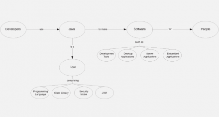
Figure 2: Armature study.
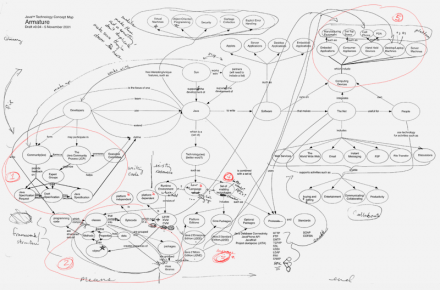
Figure 3: Armature with next level of elements added.
**Define Terms**
We defined each first-, second-, and third-level term, adding definitions to the spreadsheet. The list of definitions served as a foundation for later work. In discussions with reviewers, the definitions allowed the team to focus on individual words, without referring to the map. The list of definitions was particularly useful in conversations with reviewers who didn’t understand that map, especially when they reviewed early versions.
+ 205 definitions were collected from 8 sources.
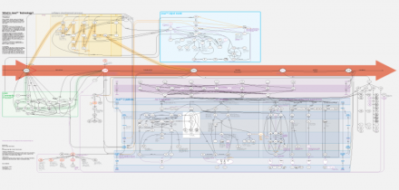
Figure 4: Early composie.
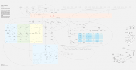
Figure 5: Final composite; content basis for final design.
*Organize Terms*
We organized the first-, second-, and third-priority lists into a single outline. We experimented with several variations. For the most part, category titles in the outline were first-priority terms.
**Test Armatures**
When the number of terms in a concept map exceeds 9 or 10, introducing levels or hierarchy may make reading easier. Large concepts maps (more than 50 terms) are almost impenetrable without attention to both semantic and visual hierarchy.
We like to organize large concepts maps around an “armature”, a primary sentence or two. A good place to start is with a horizontal sentence placing the main concept in a context; then add a vertical sentence defining the concept. Other terms link off the armature.
An armature should include the terms most fundamental to the concept being mapped. These fundamental terms and relationships serve as the backbone for the rest of the map, providing structure and hierarchy. The armature is often a starting point for readers.
We experimented with several armatures. The client and the design team chose the armature with the most meaningful relationships and the one that provided space (both physically and logically) for the rest of the terms.
**Add Terms**
We added second- and third-priority terms. New terms suggested changes to the armature.
**Review and Revise**
Once we had an armature fleshed out with secondary terms, we reviewed the map with the client and a small group of Java experts. They suggested additional reviewers. From this early stage, reviews were ongoing. We continued to interview stakeholders while we developed the concept map, asking them to review and comment on the current version.
Reviews took place in one-on-one interviews, on the phone, or via email. We sent drafts of the map to groups within Sun. We also posted large, printed copies in high-traffic areas at Sun; reviewers wrote directly on the map or attached yellow stickies.
Marked-up maps were returned to us. Several people
reviewed the map multiple times.
+ 36 people reviewed the map in one-on-one interviews.
+ 10 people provided feedback via posted maps.
**Subdivide Large Maps**
As we added terms, the map became unwieldy and difficult to consider as a whole. So: We divided the map into logical sections.
Subdividing the map increased efficiency. We distributed sections to members of the team who refined their sections simultaneously. They added terms and modified relationships, and, in some cases, created secondary armatures. We reassembled the sections around a refined armature, paying special attention to relationships between the sections.
+ At its largest, the map measured 3 x 8 feet.
**Refine the Typography**
Jim Faris and Harry Saddler proposed several options for the form of the map. The team adopted Sun Sans as the primary typeface, conforming to Sun’s corporate identity standards.
Early sketches produced some new typographic devices that were eventually applied to the map. One device was a sort of footnote or hypertext link, which allowed us to indicate more relationships without drawing more long lines across the map.
+ Refining appearance required 7 complete revisions.
**Check Again**
Throughout the project, we worked with a copy editor. She checked each comprehensive revision for spelling, grammar, and sense. Sun’s legal and trademark department also reviewed the map several times, as did an attorney working for our client’s department and two subject-matter experts.
At the end, Sun’s marketing department asked for a few visual changes—and we faced a nerve-racking few days when a senior manager questioned whether the map contained too much proprietary information. Luckily we were able to show that the information was all already available on java.sun.com.
+ The map went through a total of 53 numbered versions—releases.
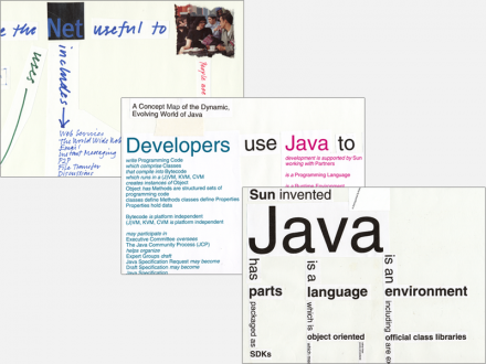
Figure 6: Early visual style sketch.
Figure 7: Final poster.
**Print and Distribute**
The map was printed at Color Graphics in San Francisco. Sun initially distributed the map at the JavaOne conference in Japan.
**Project Stats**
The final map contains:
+ 235 terms
+ 425 links (relationships)
+ 110 descriptions
We began the map in October 2000 and delivered printed copies in September 2001.
The process required:
+ 49 weeks
+ more than 50 interviews
+ more than 100 meetings
+ more than 2000 emails
The team that created the map included:
+ Audrey Crane, project manager, interviewer, researcher, mapper
+ Paul Devine, content expert, mapper
+ Hugh Dubberly, interviewer, mapper
+ Jim Faris, mapper, graphic designer
+ Paul Pangaro, our client
+ Harry Saddler, content expert, mapper,
graphic designer
+ Ylva Wickberg, interaction programmer
**More Information**
For more on concept mapping, read Gowin and Novak’s *Learning How to Learn*.
For more on teaching concept mapping, read Dubberly’s [The Baseball Project: A Step-by-step Approach to Introducing Information Architecture][2].
See the [Java Technology Concept Map][3] which inspired this article.
[1]: https://www.dubberly.com/java_concept_map_flash/ “Flash version”
[2]: https://www.dubberly.com/articles/the-baseball-projects.html “The Baseball Project”
[3]: https://www.dubberly.com/concept-maps/java-technology.html “Java Technology Concept Map”
1 Comment
XDiesele01
Jul 22, 2010
1:05 am
<3, and =].