*Written for Interactions magazine by Hugh Dubberly.*
For the last few years, innovation has been a big topic in conversation about business management. A small industry fuels the conversation with articles, books, and conferences.
Designers, too, are involved. Prominent product design firms offer workshops and other services promising innovation. Leading design schools promote “design thinking” as a path to innovation.
But despite all the conversation, there is little consensus on what innovation is and how to get it.
The current conversation about innovation is similar to an earlier conversation about quality. As recently as the late 1980s, quality was something businesses actively sought but had trouble defining. Today, statistical process control, TQM, Kaizen, and Six-Sigma management are common tools in businesses around the world.
As businesses have become good at managing quality, quality has become a sort of commodity—“table stakes,” necessary but not sufficient to ensure success. When everyone offers quality, quality no longer stands out. Businesses must look elsewhere for differentiation. The next arena for competition has become innovation.
The question becomes: Can innovation be “tamed” as quality was?
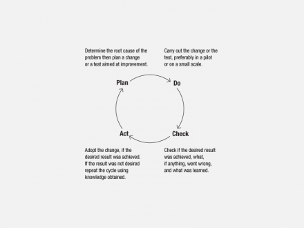
A key step in taming quality was Walter Shewhart and Edward Deming proposing a process model. (Shewhart, 1939) Their quality cycle is now widely taught and has become an important part of the quality canon. But innovation has no corresponding model.
Can we reach consensus on such a model for innovation?
One step may be to propose models for discussion.
Last year, Lance Carlson, President of the Alberta College of Art and Design (ACAD), initiated a project (through ACAD’s Institute for the Creative Process) to create a [“concept map” of innovation][1]. The Institute worked with ACAD faculty, Dubberly Design Office, Paul Pangaro, and Nathan Felde to develop a series of models and published one as a poster.
This article describes the published model and illustrates the process of developing it.
Concept maps
—
This model of innovation takes the form of a concept map. “A concept map is a schematic device for representing a set of concept meanings embedded in a framework of propositions.” (Novak and Gowan, 1984) In a concept map, nodes and links form a web of meaning, a semantic mesh. Nodes are nouns. Links are verbs. A noun-verb-noun sequence forms a proposition, a sentence. Concept maps are similar to entity-relationship diagrams and entailment meshes, though less constrained and less rigorous.
This concept map uses text direction and arrows to indicate reading direction. Type size indicates importance and hierarchy. Colored backgrounds join related terms.
Creating concept maps involves trade-offs. Adding terms provides detail and may help clarify, but more terms mean more links, increasing the reader’s effort.
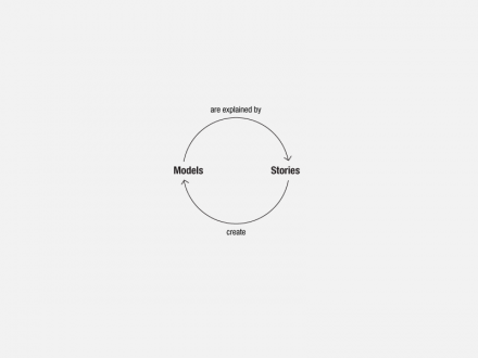
Concept maps differ from traditional texts by making links explicit, by creating multiple pathways. People often ask, “Where should I start reading?” You can start anywhere. Concept maps have no real starting point; they are webs. Still, like any model, concept maps benefit from explanation. They can be explained by telling a story. Conversely, telling a story paints a picture, creates a model in the mind of the listener.
**PDCA quality cycle**
In 1939, mathematician Walter Shewhart published *Statistical Method from the Viewpoint of Quality Control*, in which he introduced the PDCA quality cycle. Edward Deming worked with Shewhart at Bell Laboratories and later popularized the quality cycle, especially in Japan.
**Model-story cycle**
Explaining a model involves telling a story, navigating a path through the model. Similarly, telling a story builds a model of actors and their relationships in the mind of the listener.
Reading the map
—
The map is built on the idea that innovation is about the evolution of paradigms. In contrast to innovation processes, quality processes typically work within existing paradigms. Quality is largely about improving efficiency, whereas innovation is largely about improving effectiveness. Improving quality is decreasing defects. Defects can be measured, progress monitored, quality managed.
Business Week design editor Bruce Nussbaum asserts, “You can’t Six Sigma your way to high-impact innovation.” (Nussbaum, 2005) Though some six-sigma advocates disagree, Nussbaum points out a fundamental difference between managing quality and managing innovation. Innovation is not getting better at playing the same game; it’s changing the rules and changing the game. Innovation is not working harder; it’s working smarter.
Chris Conley suggests a slightly different frame. He contrasts innovation with operations. He observes, “Most businesses organize for operation, not innovation.” Organizations by their nature are conservative. They maintain a way of doing business, a way of living, a way of using language. They conserve convention.
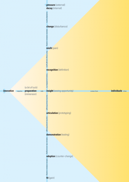
**Vertical axis: The innovation cycle**
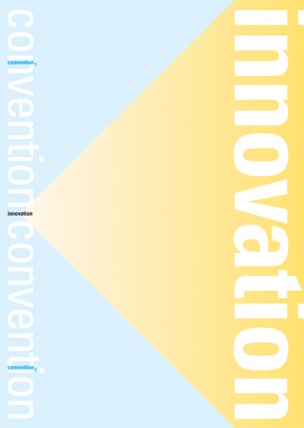
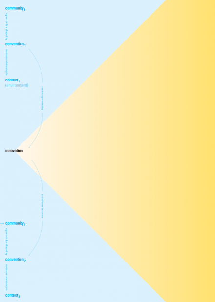
The map situates innovation between two conventions. An innovation replaces an earlier convention and in time becomes a new convention. It is a cycle—a process in which insight inspires change and creates value.
We rarely recognize innovation while it’s happening. Instead, innovation is often a label applied after the fact, when the results are clear and the new convention has become established. The process begins when external pressure or internal decay disturbs the relation between a community and its context or environment, a relationship maintained by some convention. The original convention no longer “fits.” Perhaps the context has changed, or the community, or even the convention. Someone notices the lack of fit. It causes stress and increases bio-cost. It creates enough friction, enough pain, to jump into people’s consciousness.
Perception of misfit almost simultaneously gives rise to proposals for change, for reframing. It creates the opportunity for insight. Insights only move forward when shared, articulated, prototyped. Sharing is a test: Does the insight resonate with others? Proposals for change compete for attention. Most are ignored and fade away.
The changes that survive are by definition ones the community finds effective. They spread because they increase fit, because they create value.
The map suggests a cycle moving from fit through misfit and back again. The vertical axis loops back on itself, reflecting the cycle.
**The yellow loops: the role of feedback**
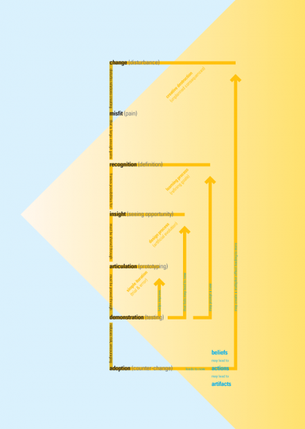
Of course, innovation processes are rarely linear. The map includes several feedback loops, suggesting the role of iteration and the recursive nature of the process. At a basic level, innovation involves experimentation, making something new and testing it. To some extent, the process may
be trial and error. The process may lead to new insights. Or it may prompt reframing of goals, consideration of new approaches, new generative metaphors. Success also leads to change: new beliefs, actions, and artifacts.
In turn, these lead to second-order change. Innovation in one place affects related conventions and may reduce their fit, hastening further innovation.
Ethnography and other research techniques can help identify opportunities for innovation. Design methods can increase the speed of generating and testing new ideas. But new ideas are still subject to natural selection (or natural destruction) in the marketplace or political process.
**Variety: a regulator**
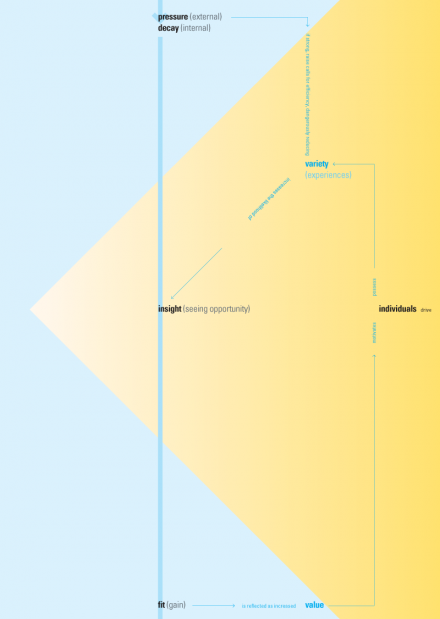
The map posits variety as a regulator of innovation. Variety is a measure of information. (Ashby, 1956) Here, it is the language available to an individual or community. Language enables conversation; conversation enables agreement; agreement enables action. Language constrains action.
Pressure to increase efficiency creates pressure to reduce variety. (Maintaining less variety requires less effort or saves time.) Reducing variety decreases the number of options a community can discuss. Conversely, increasing variety increases the number of options that can be discussed— increasing the likelihood of insight. (In practice, an increase in variety may be required for some insights to be found.) A community seeking to increase variety must integrate individuals who can increase the community’s language, provide new points of view, draw on additional types of experience, foster new conversations, provoke action. (Esmonde 2002)
**Horizontal axis: the importance of individuals**
The map posits individuals as drivers of innovation—and the source of insight. But to succeed, individuals must participate in a community, where they contribute variety.
Individuals who drive innovation also have a sense of what is not known but necessary for progress, and they understand how to find it. Individuals who drive innovation also seem to possess a healthy measure of optimism. They are motivated by the value innovation creates (which need not be monetary).
Innovation remains messy. Even dangerous. Luck and chance, being at the right place at the right time, still play a role. Like the vertical axis, the horizontal axis also folds back on itself.
**An invitation to interaction**
The story above describes one path through major points on the map, but the map offers multiple paths and invites closer reading.
While this model is not a recipe, it hints at ways we might increase the probability of innovation. But more importantly, it invites further thinking. Alan Kay noted, “we do most of our thinking with models.” (Kay, 1988) They are “boundary objects,” enabling discourse between communities of practice. (Star, 1989) This is what makes models powerful.
The poster includes an invitation to react and participate in improving this model of innovation. Just as quality is founded on the feedback loop of ‘plan-do-check-act’ and feedback loops are necessary for successful innovation (cf. the poster), we seek your insights and feedback as well. The team’s hope is for this model to spur thinking and discussion—interaction among readers. We hope it leads to other, more useful models.
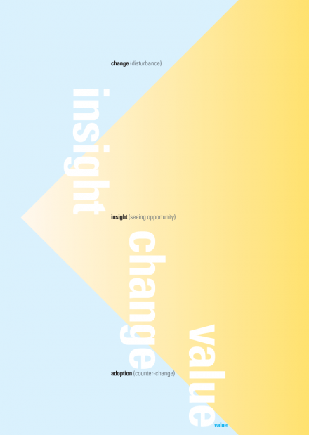
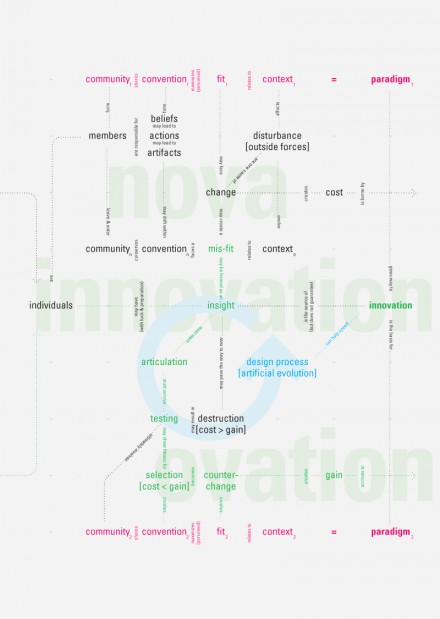
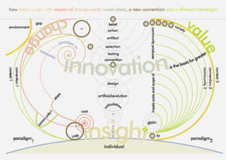
This sequence of images separates the model into components.
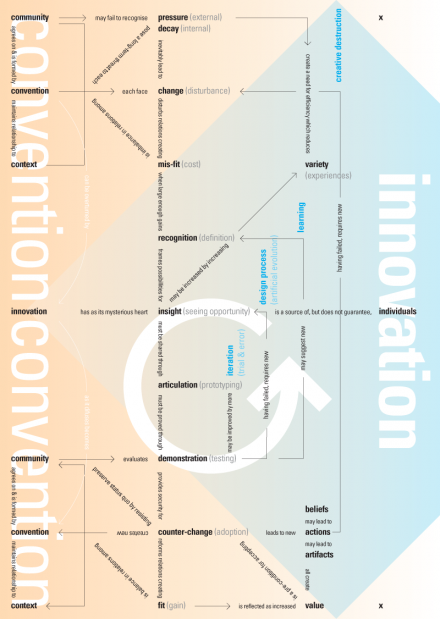
The map places an innovation between two conventions, the one that precedes the innovation and the one it becomes. The map provides an “exploded view”” of innovation—zooming in on innovation—as indicated by the yellow triangle.
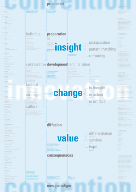
The map proposes that innovation entails insight/change/value. In other words: Innovation is a process in which insight inspires change and creates value.
An armature can aid development and reading of large concept maps. For example, a horizontal axis may set context, and a vertical axis may define the main concept. In this model, the vertical axis describes the process of innovation, wherein fit is disturbed and then restored. The horizontal axis places the source of innovation with individuals. The axes intersect at insight. Both axes loop, connecting the right edge back to left and bottom back to top, indicating that the innovation process cycles. Convention is overturned by innovation, which becomes a new convention, which is overturned by a new innovation.
In the left-most column, convention mediates between a community and its context. As a rule, a concept map should not repeat terms. This map intentionally repeats community, convention, and context, indicating that all three change as time passes.
At the center of the map are four nested feedback loops, emphasizing that innovation is not a linear, mechanical process. First is the simple iteration of prototyping and testing. Second is the design process, incorporating insight to drive new prototypes. Third is the learning process, in which problems or goals are reframed. And fourth is creative destruction, wherein an innovation in one area hastens change in other areas. (Schumpeter, 1942)
Another set of loops fill out the right side of the map. These loops hinge on variety. (Ashby, 1956) Variety is the language available to an individual or community. Pressure to create efficiency reduces variety. Yet increasing variety increases the likelihood of insight. A community seeking to increase variety must seek out individuals who can increase the community’s language and enrich its conversation.
This section shows 12 sketches developed during the design
process. More than 50 were printed at full size for discussion.
The sketches are arranged in chronological order.
**June 29, 2006**
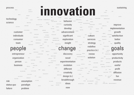
The team began with research, reading all the articles and books they could find on innovation. During the process, they developed three collections: existing models related to innovation, prior definitions, and a list of words related to innovation. The first step in mapping was to group related words and begin to prioritize. An early hypothesis was that innovation involves a change of goals.
**July 11, 2006**
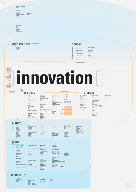
This version is one of the first that links concepts, though many are still in lists. It posits innovation as “a process of purposeful change.”
**July 21, 2006**
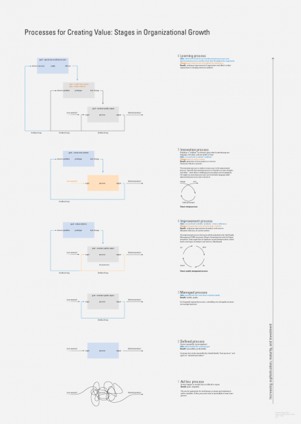
This version posits innovation as one of several processes organizations learn as they grow. An interesting idea perhaps, but it does not fulfill the assignment of creating a concept map.
**July 27, 2006**
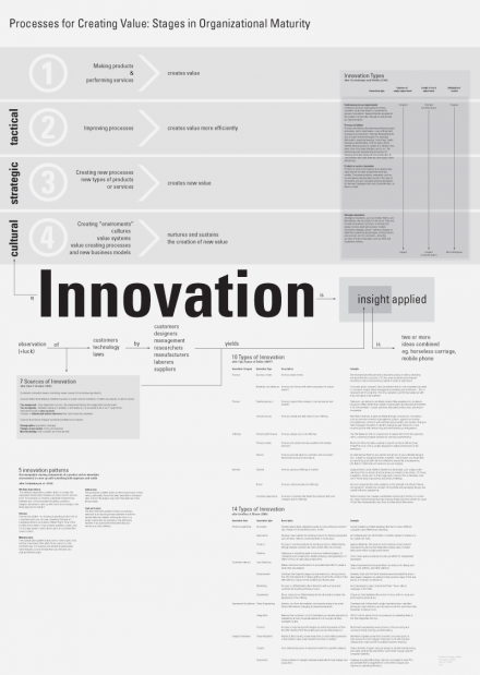
This version focuses on ways of classifying innovation, reprising taxonomies from several authors. It posits innovation as “insight applied.”
**July 28, 2006**
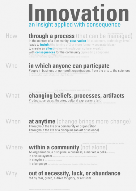
Sean Durham suggested a straight-forward, journalistic approach: who, what, when, where, why, and how. It introduces the idea of consequence, which later became value.
**September 1, 2006**
This version (one of many related studies) frames innovation as insight + change + value. Change is at the center with innovation behind it, sandwiched between two conventions. Innovation and convention are out of focus, suggesting the blurring of boundaries. The vertical axis defines the innovation process.
**September 4, 2006**
Nathan Felde suggested a number of improvements. He also sent his own version. And he urged the group to meet.
**September 10, 2006**
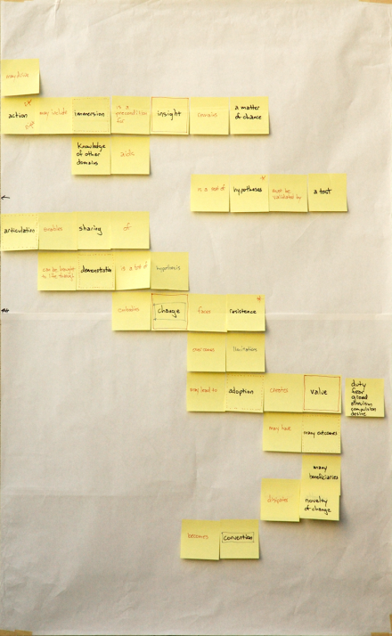
Hugh Dubberly, Nathan Felde, and Paul Pangaro met in Pittsburgh (at CMU’s Emergence Conference). They went back to the beginning, rehearsing the arguments and creating a rough outline using Post-It notes. Over two days, a new consensus formed with the team agreeing on the structure of their argument and a series of propositions.
**September 12, 2006**
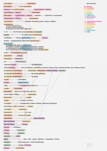
After the Pittsburgh meeting, Ryan Reposar created this version, documenting all the propositions. He also counted the number of times terms appeared in a proposition, creating a measure of their relative importance.
**September 19, 2006**
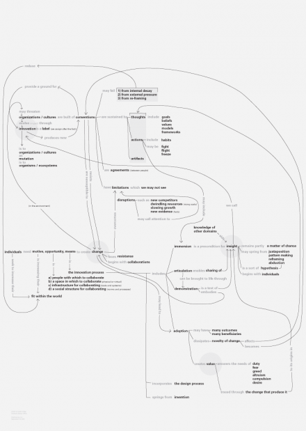
Next, Ryan linked the terms so that none repeat, creating a version that was a “true” concept map.
**February 4, 2007**
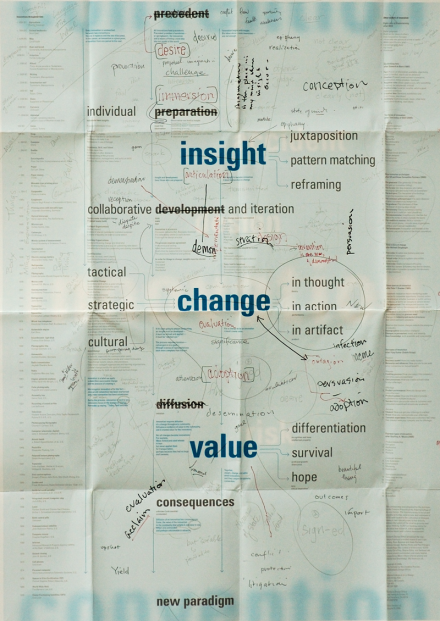
The next step was to give typographic form to the model. It still places the old convention at the top and the new one at the bottom. Terms and propositions continue to change.
**February 24, 2007**
This version is relatively close to the final. The armature is in place, as are the feedback loops. But they are not differentiated from the rest of the terms. Innovation is still the same size as convention. Insight, change, and value have not been called out. The color metaphor of a spotlight shining on innovation is not in place.
Below are a series of sketches developed by Nathan Felde. They too are in chronological order.
**July 25, 2006**
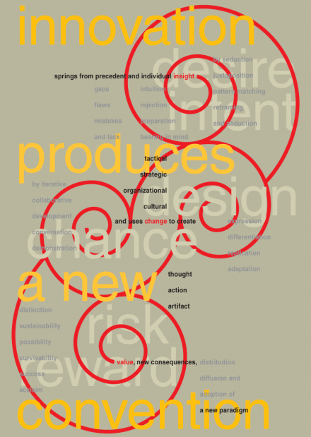
Nathan sent this wonderful poem early in the process. Sean Durham later turned it into an animation.
**September 4, 2006**
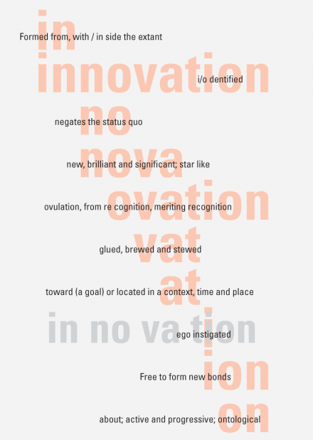
This version responds to the map created on September 1. Together, they illustrate a central tension in the team’s discussions: Can innovation be defined?
Nathan wrote: “I guess what I am concerned about [in prior models] is the representation of innovation as cut and dried. Fear, greed, need, perplexing situations and the associated behaviors and anxieties are messy and volatile.
I realize that the progress of business requires order and command and control, but the chaotic flux within which or at least from which the seeds of innovation are sown needs some depiction in our rendering of the map / diagram / output of this discourse.
Can anyone do it or can it be taught are questions that have come up. Have we resolved that or is that a starting premise to be confirmed or denied?
Are we at a juncture that mandates innovation ourselves? Is this a predicament that fosters innovation?
It appears to me that a fault or fault line discloses the opportunity to innovate, although the activities take names like think, wonder, search, toy, rummage and guess.
Design: A guessing game.”
**February 14, 2007**
Nathan proposed this playful version in response to the grid structure of the February 4 version. He described this one as “my structural engineering interpretation of the latest round.”
**February 14, 2007**
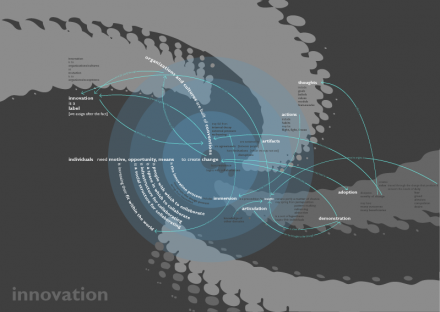
Nathan’s assistant, Purnima Rao, created this version. It contains a number of very interesting ideas. Change is literally at the center of a whirl. It posits “motive, opportunity, and means” as necessary for change. (Does that suggest a crime?) It also describes innovation as “a label we assign after the fact.”
Another View
—
by Paul Pangaro
‘Innovation’ has frustrated me for some time. Does ‘innovation’ mean ‘new idea,’ ‘invention,’ ‘design concept,’ ‘product revision,’ or ‘game-changing revolution on-the-order-of general relativity’? Making a concept map is a good way to decide what we mean. In the process of collaboration to build this map, I felt that coming to the core entailment—“Innovation is an insight that inspires change and creates value”—was an insight of its own about innovation. I sensed that if this insight countered the dilution of meaning and inspired a change in use of the term, that it would create value. An innovation about innovation. But, as with any innovation, saying does not make it so—it actually has to change a convention, and for the better. (‘Value’ means ‘positive value’). There was a point where that core entailment was lost in revision, one of many twists and turns in the process. This shows that the process of innovation can be fragile. Perhaps because I was a participant, I feel the story of making the map is as interesting as the outcome. Reviewing the spreads reprinted here retells some of that story, though flipping through 50+ full-sized prototypes retells it fortissimo. What neither tells is the tug-of-views across cities, threads of email, and fields of post-it notes. One key argument was: What parts of the process of innovation are messy, unpredictable, ineffable, mystical, magical, intuitive? (The more innovation is those things, the less we can help the process and make a deliberate innovation; at one extreme, that phrase becomes an oxymoron.) Conversely, what parts of innovation are predictable, likely, improve-able, or even deterministic? (We certainly resist the idea that the source of inspiration, the source of hypotheses, can be fully known, reduced to algorithm.) While we explored those questions, I learned that bringing about innovation, in addition to being creative, is about being stubborn. Without stubbornness, obsessiveness even, why would an individual rage against the lock-in of current convention—spend all that time in the patent office and on trains, in thought experiments outside of prior language in order to see anew? So, this is the unpredictable part: getting to the moment of genuine insight when a new means to solve a problem (a new metaphor for framing the problem- solution) breaks the lock-in of convention. This is the inventor’s phase of innovation.
Yet innovation requires a second form of obsessiveness: inspired by the possibility of bringing value, there must be drive to do something with the inventor’s insight. This role can be called ‘the innovator,’ and often it’s a different person. Propelled by demonstration of possibility, the innovator moves from insight to demonstration to fruition—to creating value.
Is it inevitable that, once invented, an insight with real potential brings about valuable change? It would seem so, though timelines and paths are not predictable. The innovator’s phase seems more understand-able, plan-able, work-able from experience. These are the aspects we can understand better, and foster, and improve.
See the [Innovation Concept Map][1] which inspired this article.
[1]: https://www.dubberly.com/concept-maps/innovation.html “Innovation Concept Map”
7 Comments
» OLDaily per Stephen Downes, 5 de febrer de 2009 TIC, E/A, PER…:
Feb 10, 2009
8:18 am
[…] Rrepesenta un model de canvi de paradigma semblant a la descripció de Kuhn. S’ha dissenyat així. Mira també Symbols.com (via Pete MacKay) que té un enllaç en un senyal aleatori. Hugh Dubberly, […]
Dubberly Design « INFORMATION VISUALISATION
May 29, 2011
12:02 am
[…] a look at the Interactions Magazine Article to see how Dubberly created this innovation map. It’s great to be able to see their process […]
Walter Alter
Dec 9, 2011
1:23 pm
The next revolution in human cognition will come with the ability to think diagrammatically. Consciousness is a heads up display, gauge function is its highest expression.
More From Hugh Dubberly | HUMAN-CENTRED DESIGN
Sep 11, 2013
9:38 pm
[…] my last post about Dubberly’s innovation model I’ve been trawling through there website (there’s lots of great stuff on there). I came across this article ‘Models of […]
Sikander
Oct 9, 2013
5:27 am
Already do all this in my head, instinctively and visually even under or over emphasising different aspects based on judgement and experience.
Have you all just hot on it. What’s new?
Wilma
Sep 20, 2014
3:03 pm
Awesome article.
Toward a Model of Innovation – i
Sep 6, 2016
1:58 pm
[…] Toward a Model of Innovation […]