*Originally published in User Interface Design Workbook, Multimedia Computing Corporation*
*Hypermedia, sometimes called interactive multimedia, offers one of the greatest promises for computing. It brings together numbers, text, drawings, photographs, animation, video, and sound, presenting them in an interactive and therefore nonlinear format.*
*Such a rich, new medium almost invites confusion. With no tradition to follow, and so many media available, information often becomes hopelessly complex and obscure. Sadly, early results have often been a confusing mess.*
*Still, the potential for hypermedia is great. The challenge for designers and authors is to find ways to make interactive multimedia clear.*
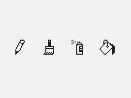
These are not a pencil, a paint brush, a spray can, and a paint bucket. They are images of tools appropriated to represent computer tools. These images make users more comfortable with the new tools. Perhaps because we still don’t see computers as independent of the tools we use them to replace, it’s difficult to think of using other images for the computer tools.
**Inventing new media**
Understanding the forces that shape all new
technologies may help us better understand
hypermedia.
People are always looking for easier, faster, cheaper
ways of doing things. This desire to improve
efficiency leads to changes in technology. At first,
a new technology is often seen as an improvement
on an older way of doing things. In time, people
stop comparing the new technology to its
predecessors and start finding new uses, new
methods, and new techniques for it.
For example, when photography was invented,
some people thought that it would replace painting
because photographs were obviously a more
accurate way to record images. While photography
certainly affected painting, the two are now seen
as different—not competing—arts.
When movies were new, they were considered
an offshoot of theater. Books instructed directors
to place the camera “far enough away from the
stage to record all the actors.” Later, directors
discovered they could move the camera and, with
it, the audience’s point of view. Along came new
techniques like pans, close-ups, and cuts. Instead
of replacing live theater, film became a different
way to tell a story. Filmmakers developed their
own way of telling stories—a language of film.
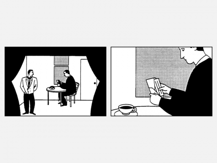
Film techniques such as close-ups let a director stage a scene differently from the way he or she might for a live theater performance.
Like all new technologies, personal computers
began as an easier, faster, cheaper way of doing
things—accounting, writing, sorting, and tracking
records. For designers, they’re a new tool for
setting type, drawing, and laying out a page. For
people who make videos, they are a new tool for
animating and editing. The new tool can be useful
for producing finished work in older media—ink
on paper or video tape.
While the computer will continue to improve as a
tool for working in other media, it is also becoming
a medium in its own right. As we try to understand
and work with this new medium—to develop
interfaces to it—we will certainly draw on our
experience with older media, but we will also have
to develop a new language for the new medium.
**Defining the problem**
Designing an interface is more complicated than
just picking up this year’s design annual and
imitating a popular look. Hypermedia is still so new
that it’s at once a blank slate, a multi-dimensional
slate, and not a slate at all. With no existing
traditions, you have to start somewhere. In order
to determine which existing conventions and
techniques are useful and to evaluate new ones,
we must set criteria.
Like all communications, hypermedia should be
clear, concise, and appropriate. The only way a
designer or author can meet these criteria is by
having a full understanding of the communication
problem and then evaluating options based on the
requirements of the problem.
The more people involved in a project, the more
complicated the process of defining the problem.
Define your communications objectives as clearly
as possible. Don’t stop with “I want it to be jazzy”
or “I like bright colors.” What’s the major point you
want to make? What are the secondary points?
What evidence or examples do you have to
illustrate those points? Who’s the audience and
why should they care about what you’re saying? Is
hypermedia really the most appropriate way to
communicate the message? Why does the message
need to be delivered in an interactive form?
Defining your objectives begins with a lot of
conversation about your purpose, followed by a lot
of testing of the results. Once you have a thorough
understanding of what you’re trying to accomplish,
you can start to figure out how.
**Muddymedia**
Because hypermedia is such a new way to
communicate, the most important goal to keep
in mind is to be clear in what you say and how
you say it. There is no room for sloppy design
in hypermedia. An image that isn’t clear will be
overlooked or misinterpreted. If a path that leads
to a crucial piece of information isn’t obvious, that
information may never be found. If the information
isn’t clear right away, your audience won’t stick
around to try to puzzle it out. Clarity of design will
make the difference between a piece that’s used
successfully and often, and a piece that isn’t used.
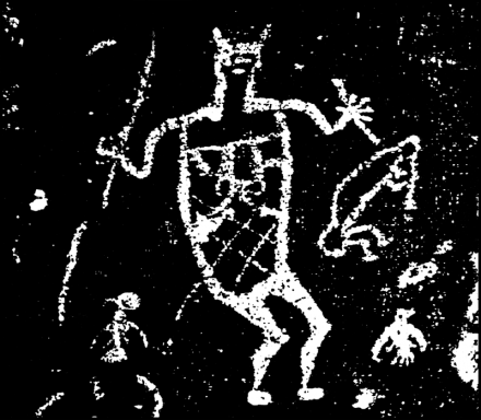
For centuries, people have used symbols to communicate. The meaning of this New Mexican petroglyph was clear to its makers, but is somewhat obscure now.
**The myth of the intuitive**
The easier an interface is to understand, the easier
it is to use. Programmers, designers, and computer
companies often talk about designing interfaces
with the goal of making them “intuitive.” But any
symbol is intuitive once you know what it means.
Symbols have meaning, not because of natural
rules, but because people agree on meanings and
teach them to others. If you set up an interface
based on a set of symbols, then people must learn
what the different symbols mean before they can
use the interface. That requires a lot of effort on
their part, especially if you use familiar symbols
in new ways. If the same symbol has a different
meaning every time it appears, then the viewer
must unlearn the old associations and learn a new
one each time he or she encounters it. That’s why
symbols can be so confusing.
When you design with symbols, you need to
understand that the assumptions that you have
about a symbol may differ considerably from the
assumptions that your audience has. When people
see a symbol on the screen, how will they know
what it means? If a symbol is also an interactive
object, it requires the viewers’ participation. How
will they know that it’s interactive, or what they’re
supposed to do with it?
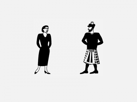
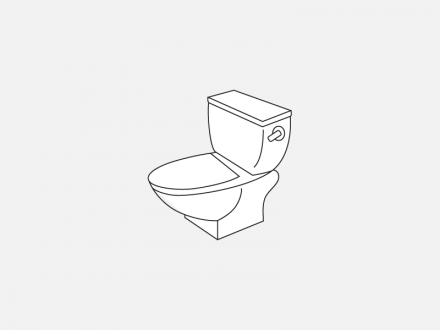
Here’s a more familiar symbol. You might say its meaning is intuitive. It certainly seems more so than the rock painting, because we’re used to seeing it on doors. We know what’s behind the door. Right?
This? Or this?
Actually, it’s this. There’s no direct relationship between
the symbol’s shape and its meaning. You wouldn’t be able to
guess what it means if you hadn’t seen it used this way before.
**Things should look like what they are**
One approach to interface design is to take some
real world environment or real world object and
use representations of it to stand for information
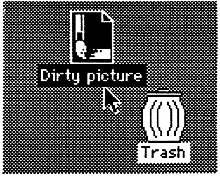
or tools. The Macintosh desktop interface is a
metaphor that people call “intuitive.” After all,
many people are familiar with documents and
folders and trash cans. But the success of the
desktop metaphor actually has little to do with
the metaphor. Its success is based on the fact that
icons are objects and that you can directly move
those objects. You can move a file into a folder or
copy it onto another disk. You can put a file in the
trash to throw it away. So you might expect that
putting a disk in the trash would erase it. Instead,
that ejects the disk. That’s one inconsistency in the
desktop metaphor. The more inconsistencies you
have, the more confusing the interface.
There’s a direct relationship between icons on the desktop and the files or actions they represent. What you do to the picture, you do to the document. Place an icon in the trash, and you delete the document.
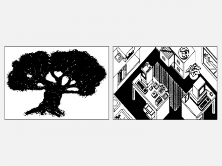
Some hypermedia documents are designed with
a table of contents that looks like some part of the
real world such as a tree, a road, or a building with
different rooms representing different parts of the
document. But these metaphors don’t necessarily
make the information clearer. If the index looks like
a tree you’d expect it to resemble a tree in other
ways, and it probably shouldn’t look like a house
unless it’s structured like a house. It’s hard to see
how these metaphors help. Making the information
look more interesting should not be a criterion.
Making it clearer should be.
It’s tempting to start designing an interlace by taking some real world environment or object and using it as a “metaphor.” Problems arise when the metaphor doesn’t precisely match the information or function that it’s intended to represent.
Designers searching for interface metaphors often
think of books. Books are a traditional place to put
words, numbers, and pictures, and might seem like
a natural model to follow in designing hypermedia.
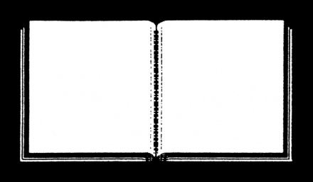
Some designers create computer screens that
look like they have “pages” with “spines” running
down the middle or the side. The premise is that
this is “friendly.” Whoever came up with the basic
structure for a book probably wasn’t trying to
be friendly. Books look like cardboard and paper
because they’re made of cardboard and paper.
Books have pages because pages are a convenient
place to put words. Books have spines to keep the
pages from falling out.
This HyperCard card imitates a book’s form but not its function.
If the computer screen looks like the first page of an
open book, you can’t tell much by looking at it. You
can’t tell which “page” you’re on, how many pages
there are, or what order they’re in. You might think
you’re “turning the page” to go to the “next page,”
when in fact you’re actually jumping to a different
“book.” You’re led to expect what you see on the
screen to work like a book—that is, to be a series of
pages, one after the next. If it isn’t, the image is
misleading and confusing. If it is, the question
remains: why put a picture of a book on the screen?
This is a little like printing a photo of a page on a
page before putting words on it.
You can’t solve the interface problem just by
borrowing the image of a familiar medium (like
storing words on pages connected by a spine).
Instead, we must find new solutions appropriate to
the new medium. The question isn’t whether hypermedia
should look like a book, a movie, television,
or anything else, because the answer is probably
no—hypermedia should look like hypermedia. And
we need to figure out what that means.
**We can’t afford gratuitous decoration**
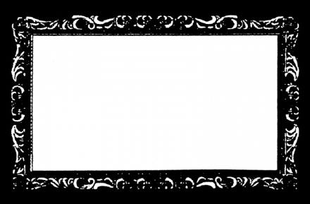
Decorative images such as dot patterns or frames
are often used in hypermedia. This approach is not
new in graphic design, product design, or even
furniture design. Take wood-grained formica. You’ve
probably seen a plastic tabletop made to look like a
natural material. But it doesn’t fool anyone. And it
doesn’t improve the table. In fact, it might have been
a perfectly good metal and plastic table if the efforts
to make it look like wood weren’t so pathetic.
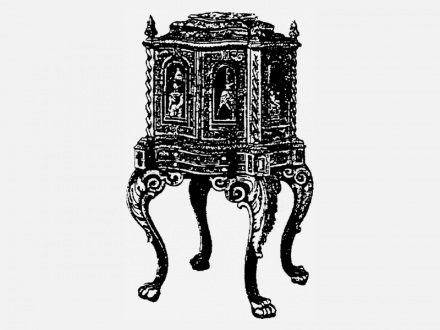
Many Victorian cast-iron stoves are covered with
“carvings” like those on wooden furniture—leaves,
claws, and all sorts of filigree. These decorations
grew out of an earlier tradition. They were an
expression of wood carvers’ skill with their tools
and of their love of their craft. The decoration isn’t
appropriate for mass-produced imitations made of
a different material. Are these the kinds of things
we need in our homes? Are these the kinds of
things that we need in our interfaces?
Decorations on some handmade furniture are an expression
of the wood carvers’ love of their craft. Such decoration has
no place in mass-produced objects made of other materials.
This is a pretty frame …
… and this is how much screen space it uses up.
That space might have been better used for information.
**“Computer art” is an oxymoron**
If imitating an old design is tempting, so is the flash
and sizzle of something new. It’s easy to assume
that the more you exploit the computer’s strengths
visually, the better the results. Such an emphasis
on technique rather than substance makes us
cringe when we hear the term “computer art.”
If you’ve ever been to a computer graphics show,
you’ve probably seen many pictures of metal
people and chrome corporate logos whirling in
space. Maybe you can paint shinier chrome with a
computer than you can capture in a photograph,
but what’s the point? When they don’t add anything
to the message or when there’s no message to
begin with, these effects are just as meaningless
and silly as plastic pretending it’s wood.
Still, animation can be very effective as a communications
device. It can be the best way to show
a process happening over time, or how something
works. With computers, you can animate things that
are otherwise impossible to see, like the inside of a
beating heart, or the fl ow of air in a thunderstorm.
Animated icons are intriguing. They could be a useful
way to show the user what’s going on. For example,
a printer icon might appear to print a document to
show that the real document is being printed in
another room. But animated icons lose their effectiveness
when every object on the screen is moving.
**Examining narrative structures**
The attempt to base interfaces on metaphors is
really an attempt to define a structure. Examining
structures in other media may help us develop
structures in hypermedia. In other media,
structures grow out of a compromise between the
physical constraints of the medium and the content
of the message. Text in a book lends itself to a
linear structure.
Some messages have simple structures. A poster
or an ad might make just one point. A stop sign is
another message which you read all at once.
Books and films have more complex structures.
These are linear or serial forms—they have a
beginning, a middle, and an end. Usually you start
at the beginning and go on through the middle until
you reach the end, and then stop. Although the
format might be linear, the story often isn’t. You
might go back in time, then skip forward.
Similar techniques apply to all kinds of narratives.
You can use flashbacks, dreams, a story within
a story, or interwoven stories to present an idea
that doesn’t fit into a linear structure. Some of
the effects used in film are ways to get around
the limitations of the physical medium. A visual
dissolve shows that time has gone by. Or a
montage of a lot of different quick shots might
show a lot of things happening at the same time.
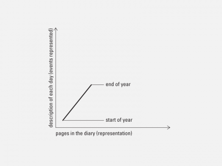
A diary is a good example of a simple narrative.
Each day in the diary corresponds to one day in real life.
Live TV coverage of an event has a similar structure.
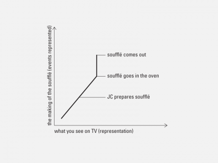
A cooking program is different. You watch Julia Child put
together the ingredients of a dish, but you don’t sit around
watching it bake. The show skips forward in time.
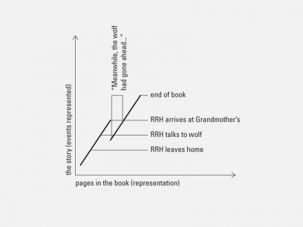
“Little Red Riding Hood” is more complex. Through a flashback
(“meanwhile…”) we find out what the wolf has been doing
while Red Riding Hood was still travelling.
Hypermedia has few of the physical limitations of
linearly structured media. Because it’s non-linear,
it can appear to have no structure at all, which can
confuse the audience. In a book or movie, you don’t
have to worry about what to do next. Without a
linear structure, three questions become important
to the audience: Where am I? Where have I been?
Where can I go?
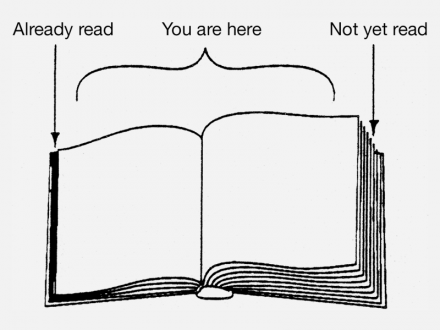
Looking at a book, you rarely stop to think about
where you are. You know that the stack of paper in
your left hand is the part you’ve already read and the
stack on the right side is what you haven’t read yet.
As you go through the book you always know how
close you are to the end, because one side grows
while the other shrinks at a rate directly proportional
to the speed at which you’re reading. But empty computer
disks look the same as full disks. You can walk
all the way around the computer, or open it up, and
still not see the data, what you’ve already seen, or
what you’ve missed. That’s why designers need to
make the structure of hypermedia documents clear.
When faced with a book, most people have certain assumptions
about where to start and where to go next.
**Defining hypermedia structures**
If we can identify and label structures within
hypermedia, then we can start to develop a
vocabulary for discussing them with each other,
with our colleagues, and with clients. The structures
give us tools for designing hypermedia systems and
making them easy to use. We’ve identified seven
basic structures: series, spatial zooms, parallel
texts, overlays, hierarchies, matrices, and webs.
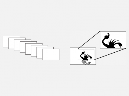
The most familiar structure is a linear series, like
pages in a book or slides in a slide show. The
HyperCard metaphor, a “stack of cards,” implies
a linear structure. You might also extend that idea
and create several interconnected linear structures.
For example, the history of painting, the history
of architecture, and the history of music might
each be represented by a time line. They might be
connected through events that influenced all three.
Series/Spatial Zoom
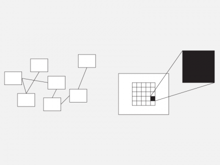
A spatial zoom lets you move between distant and
closer views of the same information. This could
work in a literal way, say, zooming in for a closer
view of a map or a diagram. You might also think
of it metaphorically. “Clicking” on a word to expand
it for a definition—like looking for a footnote—is a
kind of zoom. Thus a paragraph giving a general
overview of a topic might have “clickable” phrases
which can zoom in to more detailed information.
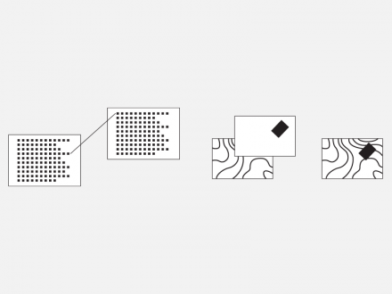
Parallel texts can be variations of the same
document or different documents with links
between relevant parts. You could skip back and
forth by following the links. You might use this
structure to represent different language
translations of the same text, different points of
view on the same topic, or different drafts of the
same document.
Parallel texts shown on the left. Overlays shown on the right.
Overlays allow you to make comparisons by
looking at different views of the same information.
You might start with a map with many different
overlays so different people could choose political,
historical, or geographical views of information.
Displaying two or more different sets of data on
the same map can lead to startling discoveries.
Edward Tufte has described how, in 1854, Dr. John
Snow ended a cholera epidemic in London by
plotting the location of water pumps and cholera
deaths on a map of the city. Overlaying these three
pieces of information clearly showed that most of
the deaths occurred near a single pump. Dr. Snow
had the pump handle removed and ended the
epidemic. Peeling away overlays can also reveal
structure, as in transparent anatomy drawings.
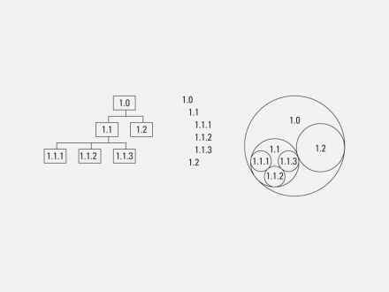
Hierarchical structures are among the most commonly used in hypermedia. They start with a main menu that branches to a number of different paths. Typical examples are organization charts, family trees, and most training projects where students make choices to follow different paths of study. These trees are often modified to provide connections between branches. For example, a hypermedia organization chart might show all the departments in a company. Connections between branches might show the fl ow of projects through the business.
**Tree or Hierarchy**
Though these may not look like trees,
they share the same structure.
A web or network structure doesn’t follow a
hierarchy or path. The nodes are connected to each
other based on relationships seen by the author.
Associations you make in your mind work this way.
So do airline routes.
Web or Network shown on the left. Matrix shown on the right.
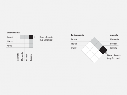
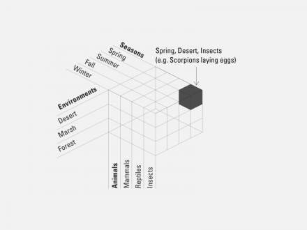
A matrix is a multi-dimensional grid, most familiar
as a Cartesian coordinate system. Several linear
paths intersect to take you to one particular point in
a matrix (x,y). You might find your way there by
answering a series of multiple-choice questions.
Your answers define a unique point in the matrix.
For example, a shoe store is a sort of matrix of
shoes. Your purchase is defined by a point in the
matrix: men’s, black, leather, size 9, wingtips. A
linear structure is a one-dimensional matrix.
This is by no means a definitive list of structures.
There are probably others. They are rarely found in
isolation. In practice, most hypermedia documents
make use of several combined structures. You can
use these structures to organize information and to
give users a sense of where they are, where they’ve
been, and not only where they could go, but also
where it could be most interesting to go next. Of
course, you still can’t open up your computer and
see where you are—but you shouldn’t need to.
These two diagrams show how a point might be defined
on a two-dimensional matrix. We first saw this sort
of diagram in a stack by HyperPro.
This is one way a point could be defined on a three-dimensional
matrix. We first saw this sort of diagram in a stack designed
by Paul Souza.
Once you’ve defined a structure, there are a
number of ways you can make it visible to the
viewers. You can start with a simple diagram
showing the stack’s structures and the connections
between them. You can design navigation tools to
reflect the structure of the stack, for example, users
might click on parts of a grid to find information
in a matrix, or they might click on text buttons
to define criteria and then see the corresponding
point highlighted on a drawing of a matrix.
Finding ways to make hypermedia structures clear
is an area which needs a lot of work, and which
offers tremendous opportunities for designers.
**Making HyperCard stacks clear**
Many of the designers now working with
hypermedia are using HyperCard to create “stacks”
of interactive “cards” on the Macintosh screen.
Clicking on “buttons” on the screen can take you
across “links” to other cards or stacks. This section
covers techniques that we’ve found useful in
making the interface to HyperCard stacks clear.
These techniques could also apply to other
hypermedia systems.
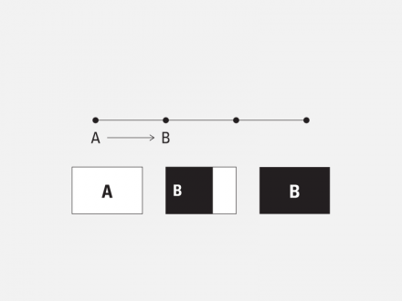
A scrolling or wiping movement to the right or left shows
linear movement.
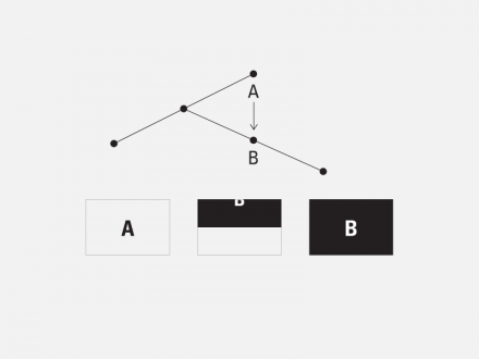
Scrolling or wiping up and down shows movement between
different levels in a hierarchy.
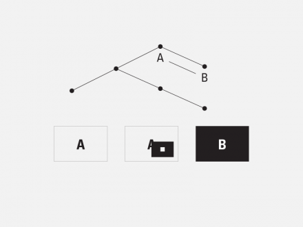
Zooming in and out shows movement to more detailed
or more general information.
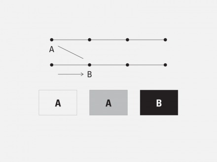
A dissolve shows a transition to a different structure or topic.
Borrowing from the language of film, you can
use visual effects to show movement within a
structure. The way one card is replaced by another
can tell users whether they’ve moved one node
along a linear progression, dived down a path in
a hierarchical structure, or travelled to another
structure altogether. When you move forward or
backward along a path, the image on the screen
might appear to slide to the right or left. If you’re
following a layered structure, the image might
appear to scroll up or down as you travel between
layers. Zooming in and out reinforces the idea
of moving to a closer or more general view on a
topic. Visual dissolves are often used in film for
transitions to another place or time. In hypermedia,
they’re useful for moving to a new topic or a
new structure. If you establish and follow simple
conventions, viewers will find it easier to orient
themselves within the structure.
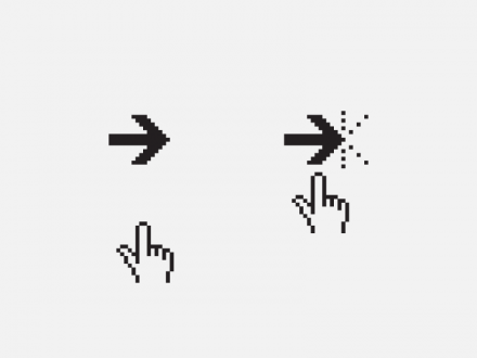
Visual effects are one way to make sure people
know when they’ve clicked on an interactive area.
Other forms of feedback, such as designing buttons
so that they highlight briefl y when clicked, are also
helpful. When a complicated program or script is
involved, several seconds may pass between the
user’s click and the screen’s reaction. During this
time the user may think that he or she clicked in the
wrong place, or that the computer isn’t working. If
they can see a response immediately, most people
will wait for the action. If nothing seems to happen,
they may get frustrated and confused.
It’s helpful to see feedback when you click on
an interactive object.
Audio feedback is a risky alternative. How long
would you keep reading a book that made a noise
every time you turned the page? On the other
hand, sound that comes up only a few times
during the exploration of the stack might provide a
welcome surprise or reward—perhaps at the end,
or when a problem is solved. Find out about the
environment in which the stack will be used, then
decide whether sounds are appropriate. Visual
feedback is just as immediate as audio feedback
and sometimes easier on the nerves.
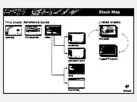
Where there’s a structure, there should be a map.
The map doesn’t have to show every card in the
stack, but it should show the general structure and
the relative size of each section. It should show
users where they’ve already been, and where they
can go. You can use highlighting to indicate areas
that have already been explored. You might also
point out the most recently visited area and make
the map interactive so users can jump to parts of
the stack by clicking on the map.
If you can’t picture where you are, it’s hard to know where
you can go. A map provides an overview of an entire stack.
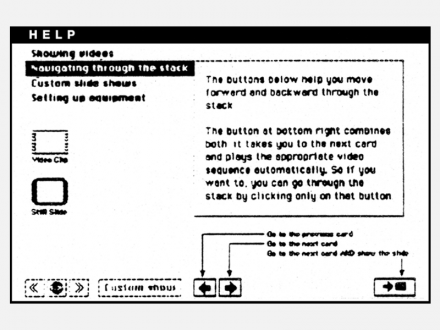
No matter how simple your stack is, it should
include a help system. You can’t assume that
everybody will understand how to use the stack
the first time they see it. Nor can you assume that
printed information you send with it will be read—
or kept. Build a help system into the stack and
make it accessible from anywhere within the stack.
A help system can be as simple as a single card
with all the stack navigation buttons labeled and
explained, or as complicated as a series of cards
that animates all the stack’s functions and shows
different information depending on what part of
the stack the user is in.
Explain the function of every part of the stack.
**Reading a computer**
Text is hard to read on a computer screen, even
if you like to read. Most people get around this
problem by not reading text on the screen. The
more text, the less enthusiastic people are about reading it. Fortunately, hypermedia is good for
dividing information into chunks. Experiment with
different ways to format text. Instead of filling up
a screen with words, put a readable amount of
information on each card and then link to other
cards for more. Or try editing your copy down to a
summary full of buttons that link to supplementary
paragraphs for those who are interested.
Avoid stuffing a lot of text into scrolling fields.
They’re a good way to store a lot of information in
one place if you need to look up data from a list,
but they’re hard to read and hard to print. Often,
people don’t bother. If you put so much text on each
card that you have to scroll through it to read it,
why are you publishing in hypermedia? Consider
paper—it’s generally cheaper than a computer and
weighs a lot less.
**Choosing a screen font**
Once you’ve made sure you’re presenting a
readable amount of text on each screen, choose a
readable font and style. Your choice should reflect
compassion for the reader more than artistic taste.
Remember that a computer screen is made up of
many rows and columns of rectangles which are
either light or dark. Italic fonts are hard to read on
the screen because they don’t take advantage of the
fact that you can stack these rectangles on top of
each other and make a straight line. On a computer
screen, a slanted line looks jagged. Outline fonts
seem to disappear on the screen, and it’s hard to
make out the details that distinguish one letter from
another. When projected, white type on a black
background looks sharp, but small white type on
a black screen is harder to look at, and should
probably be avoided.
Type that’s italicized or outlined is hard to read on the screen.
It tends to look jagged and messy.
These fonts were designed to mimic metal typefaces.
They generally look better printed on paper than on the screen.
Some fonts are better than others for screen
display. Helvetica and Times are clean and readable
at large sizes. At small sizes, however, they get
messy on the screen. Switch to their cousins,
Geneva and New York, which were designed for the
Macintosh screen. Fonts designed for the screen
are generally easier to read than fonts that are
designed for paper (though the latter might look
better when printed).
These fonts were designed to be read from the screen.
They generally look better on the screen than on paper.
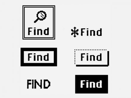
**Be clear and consistent**
In hypermedia, some words and graphics on the
screen are interactive objects. If you want people
to click on the correct images, you need to tell
them where to click. Marking the interactive areas
can be as simple as using a consistent font to
label them or keeping them in the same place
from screen to screen. Buttons don’t necessarily
need thick borders around them, arrows pointing
to them, or angels dancing around them. Find the
most appropriate way to define and differentiate
interactive objects.
What’s the clearest way to differentiate buttons
from other images on the screen? It’s not necessarily
adding a lot of visual noise.
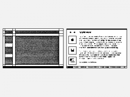
Grid shown on the left. Card based on the grid shown on the right.
There’s no need to make each screen different—in
fact, it’s confusing. Similar information should have
a similar form. Then people will quickly understand
where to look and what to look for if they want
information, instructions, help, or navigation tools.
If you use a button the same way throughout the
stack, it should always look the same, work the same
way, and appear in the same place. A consistent
layout will make your stack easier to look at, since
the text and images on the cards won’t appear to
lurch back and forth and up and down as you move
through them. If your design is consistent and clear,
your stack will be easy to understand and use and
people will be more likely to use it.
**The potential of hypermedia**
One of the first people to write about architecture,
Vitruvius wrote that the three principal concerns for
design should be solidity, commodity, and delight.
That is, a building must stand up, be useful, and
give pleasure. These principles apply to hypermedia
design as well. The programming must work
without bugs. The message and its structure should
be clear. And the experience should be a delight.
Clarity comes first because the message and its
structure determine the necessary programming.
And delight is hard to find amid confusion.
There’s tremendous opportunity here, and some
real challenges. But if designers blindly try to fit
hypermedia into pre-existing molds, it won’t be as
effective as other ways of communicating. Instead,
just as film did earlier in this century, hypermedia
must continue to evolve and develop its own
language. We need to strike a balance between
what we’ve learned from earlier media and the new
possibilities that are opening up now.
This is an exciting time to be a designer. When was
the last time a new medium was invented? This is
a great time for experimenting with hypermedia.
Everything is new. Everyone can contribute to the
creation of a new way to communicate.
**About the authors**
Doris Mitsch and Hugh Dubberly worked together
designing communications materials for Apple
Computer. Their work includes brochures, posters,
animation, videos, HyperCard stacks and interactive
multimedia. Doris is now an Art Director and
Multimedia Producer at Clement Mok Designs
in San Francisco. Hugh is Chair of the Computer
Department at Art Center College of Design.




3 Comments
Jonathan
Apr 1, 2012
6:28 am
Thank you for this. A wonderful article that was a pleasure to read.
Ilse
Apr 1, 2012
7:44 am
Very well done, enjoyed every word, thank you.
Mac MacMac
Apr 1, 2012
8:11 am
Great April Fool’s Day Joke! Only a Mac user wouldn’t figure out that this must have been written back in the 80s — the rest of us realize that hypermedia authoring tools have been available everywhere for a decade or more (hint: What starts with http://?)
And the reference to “The Macintosh desktop interface” is precious. The authors clearly mean ‘The Xerox Desktop interface,” on which I wsa doing hypermedia before the Mac came out.
ROTFL!